Client
Riot Games
Agency
JDK
Role
Concept, Design
Category
LogoAbout This Project
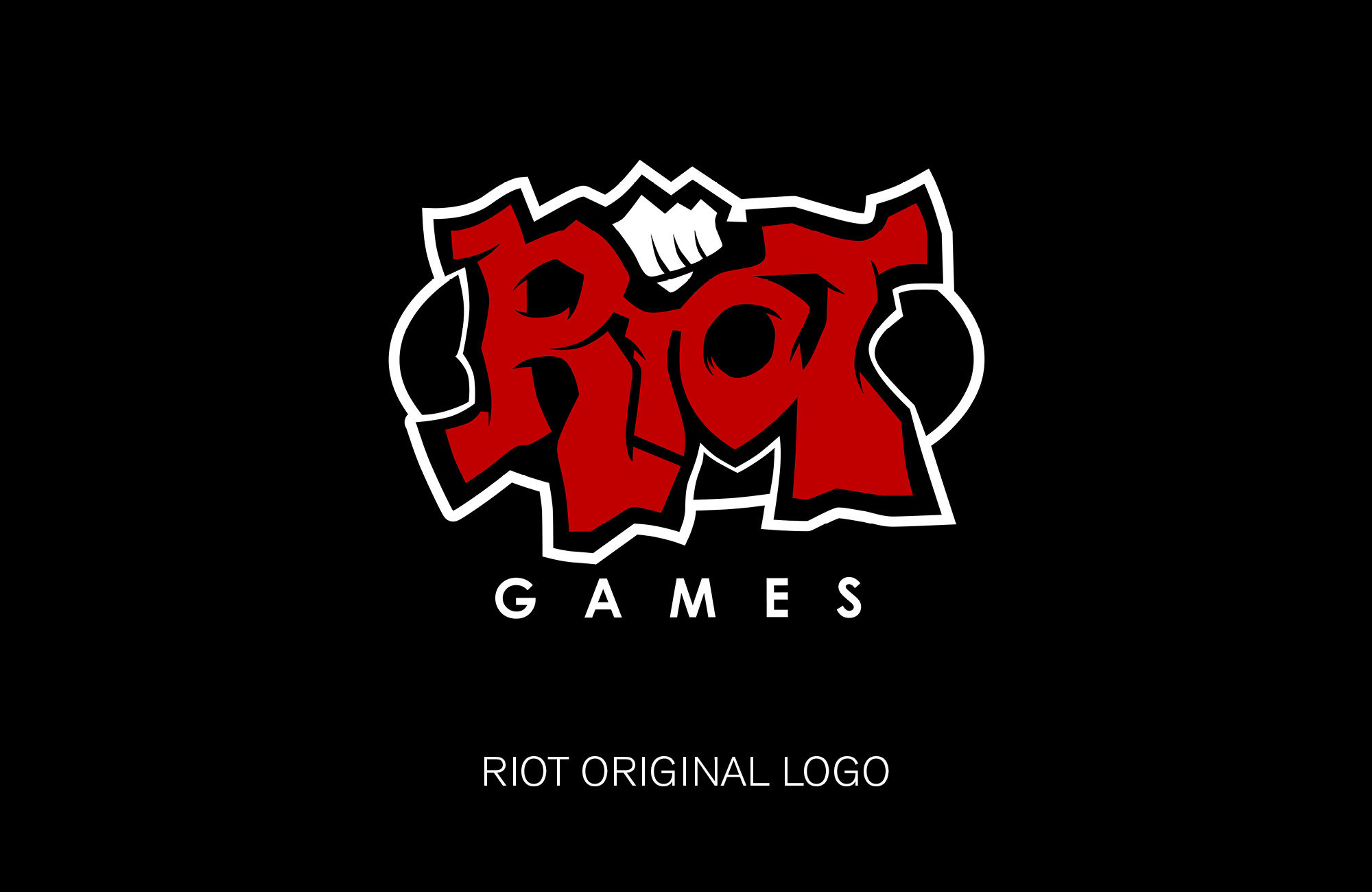
Riot found itself at a critical juncture, a brand deeply rooted in hardcore video games, and exploding into a global entertainment company. Riot asked JDK to explore if and how the current logo should evolve.
The challenge and opportunity was to stay true to the Riot brand and equities while evolving the quality, intentionality, and kickassiness of the mark. Riot identified strongly as a rebellious community of builders with a very DIY, get it done attitude. It was very important to Riot to communicate this in any logo that they may use to represent their company. As well as speaking to their core group of gamers. I was brought into this exploration due to my experience crafting the visual identity for Xbox.
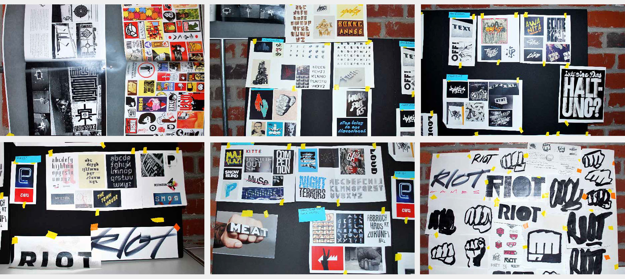
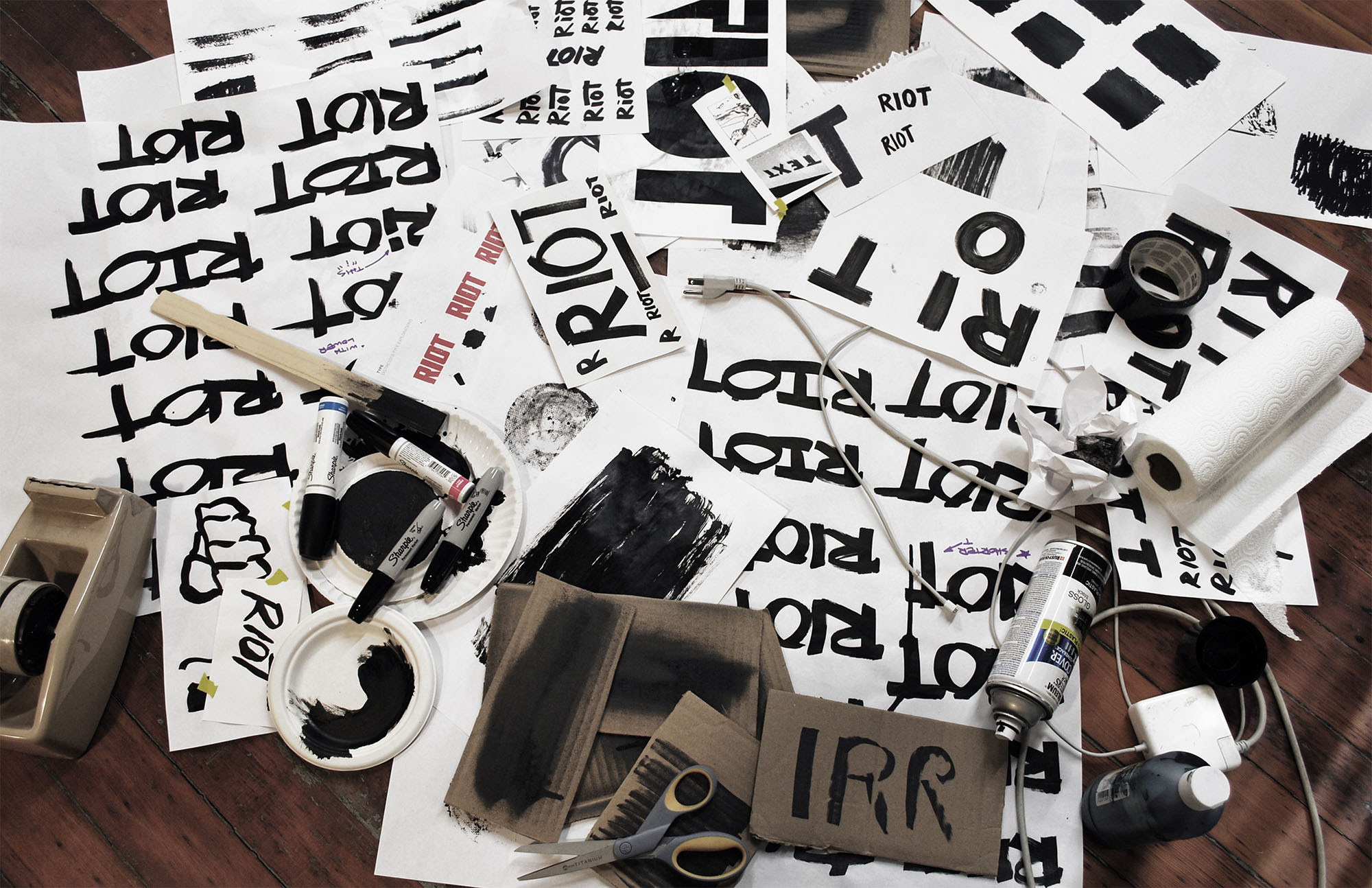
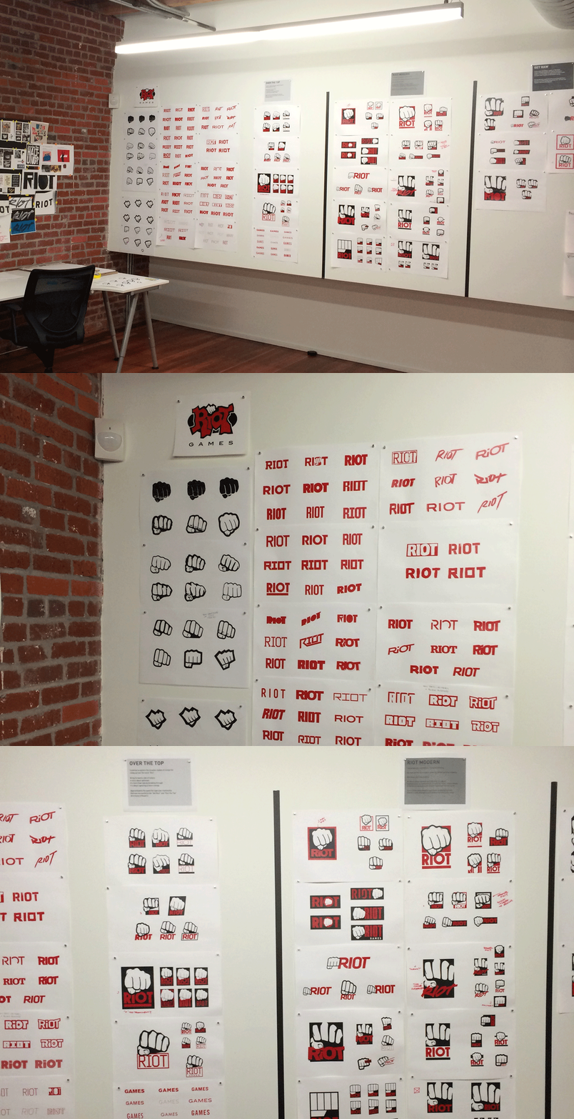
The process for this exploration involved initial mood boarding as well as sketching before moving into creating logos. Many hours where spent on exploring styles of graffiti, textures, the effect of distress on various surfaces, as well as the aesthetic of crafting and working in many DIY mediums. For this exploration these steps, while time consuming, where vital to remain true to the DIY/rebellious aesthetic a final logo would needed to have. It was only after this stage that final logo exploration began.
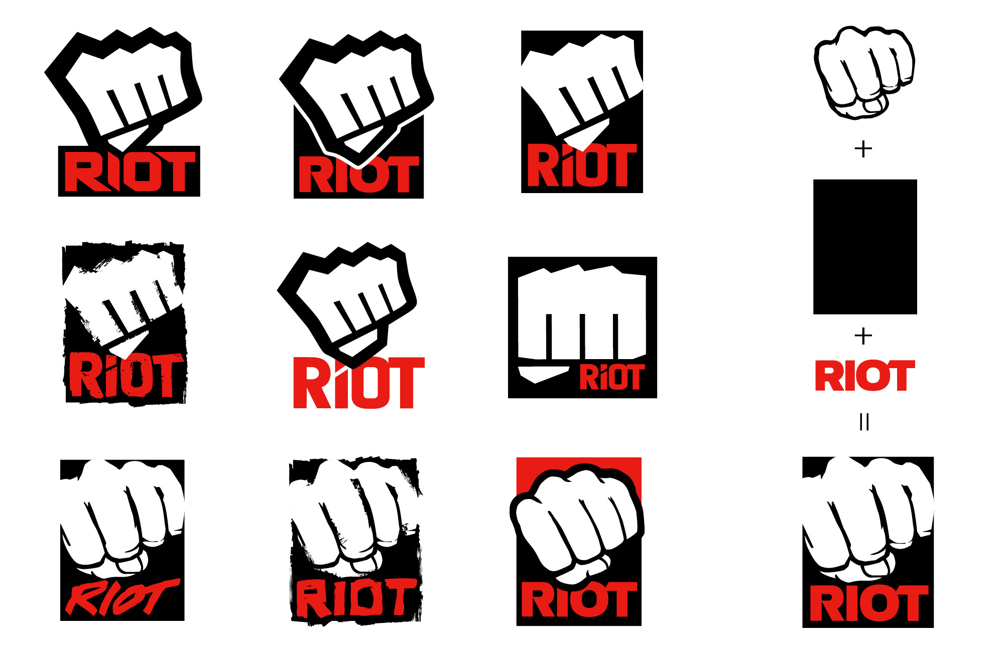
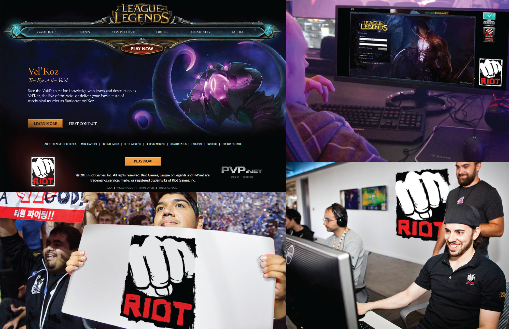
The Riot logo consists of two elements which Riot felt where key to their identity and needed to remain in any future logos the Riot wordmark and the fist. These two elements where explored separately as well as together in crafting the logo explorations. Finally logos where shown in situation so as to give a better perspective on how the logos would look in actual usage.

