

Client
Black Rock City Gate Perimeter & Exodus
Agency
Self
Role
Concept, Design Direction, Design
Category
Logo, Visual IdentityAbout This Project
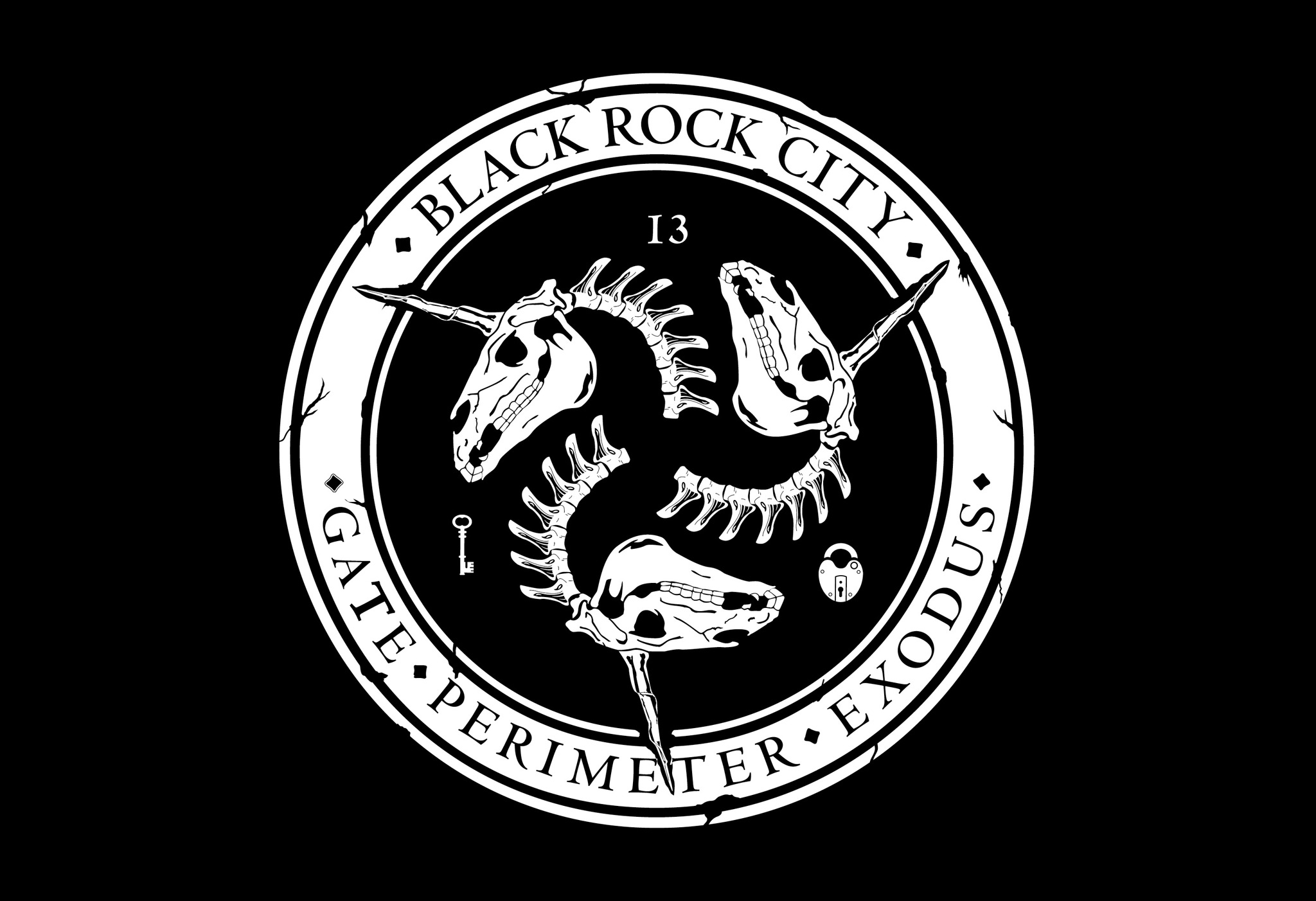
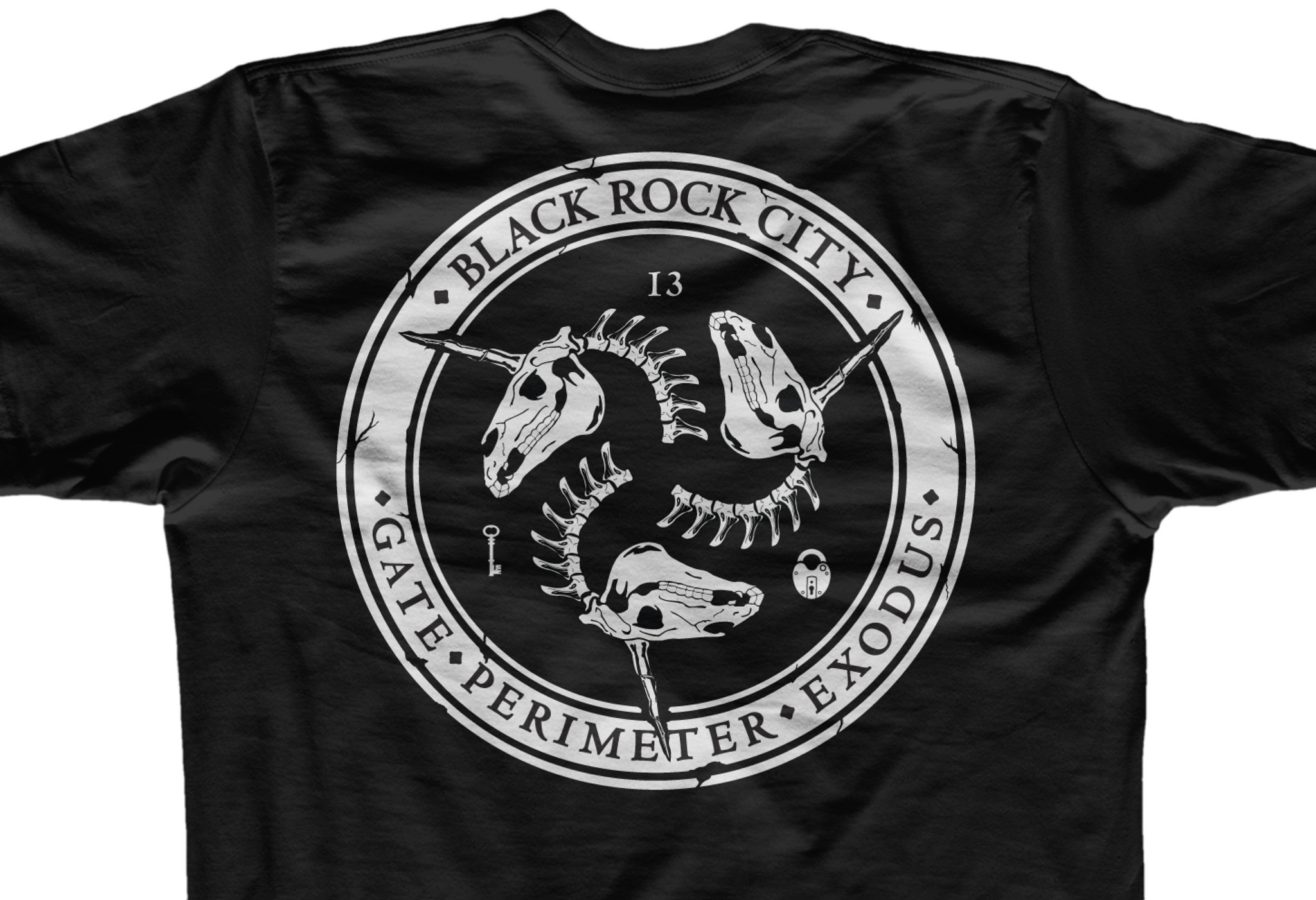
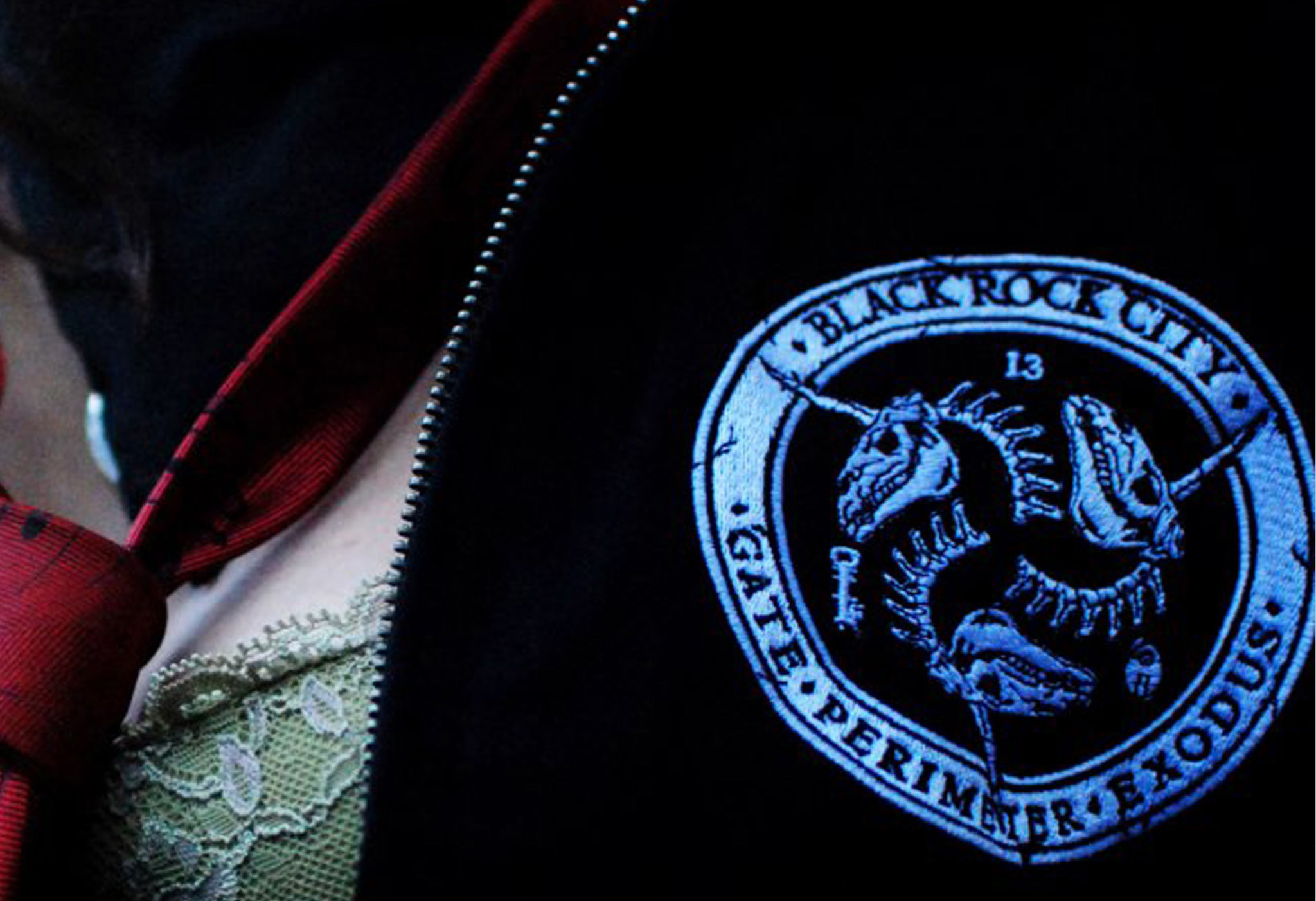
Each year, the Burningman Gate crew design a new logo that fits in with the current year’s theme and speaks to the department. Key elements are skulls and bones, the key, the lock, and the number 13. For 2012 I designed the department logo, for me this was a labor of love. Every year that I have attended burning man I have been helping this department wrangle sparkle ponies (AKA burners), as well as taking tickets, search vehicles, and act as a type of event security. 2012’s theme was fertility, The unicorn symbolism fit with this theme, and the three ponies are also a nod to the three-headed beast of a department. I felt three horses was also a subtle joke about the world supposedly ending in 2012 due to the Mayan calendar. One horse short of the apocalypse, right? This project also allowed me to practice some of my illustration and logo design skills in a fun way.


